The Search for a Name
Back when we were working on our High Concept 1.0, we didn’t even have a logo yet. Honestly, we weren’t even 100% sure about the name. That has changed by now. The idea for Forestbound came about rather spontaneously. Probably influenced by all the game names you hear out there—and somehow, “Bound” in names seems to be quite trendy at the moment. Only afterward did we realize how many games already have similar names. But by then, we were already committed. Internally, we also just liked Forestbound the best. The word really says it all: forest. adventure. being on the move.
What the Game Is About
Forestbound focuses on orientation, experiencing the forest, and the special feeling of trekking and hiking. A unique kind of cozy survival game. No zombie slaying, no post-apocalyptic scenarios. Instead, real outdoor skills: navigation, setting up camp, and exploring nature.
The First Logo Draft
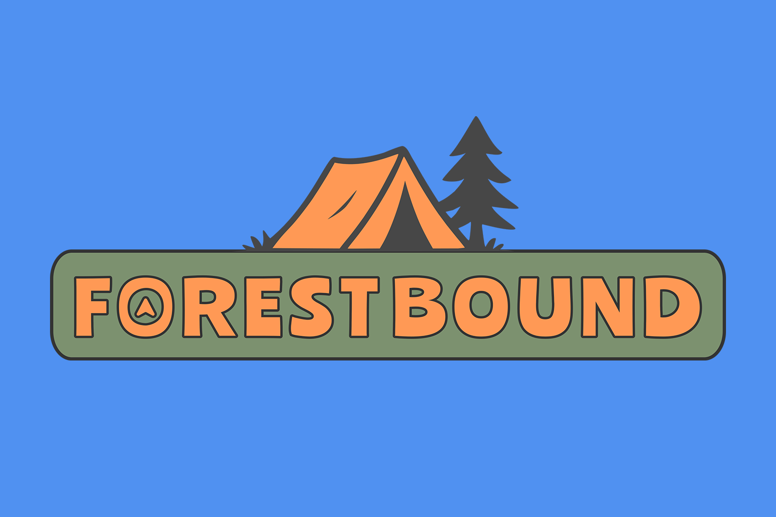
For our pitch slide at Gamerei, everything had to move quickly. I didn’t want to just throw some text on there, so I quickly opened Inkscape. That’s how our first, preliminary Forestbound logo came to be—inspired by those round patches you can iron onto your backpack.

Font Tests

That was my first font selection. I immediately had the idea to maybe modify the “O”s a bit to bring more of an outdoor vibe into the letters. From top to bottom, I tried Amatic, Patrick Hand, …, Montserrat, Manrope, Outfit, Bowlby One, and Ranchers. Personally, I actually like the playful fonts like Bowlby One and Ranchers the best. The only question is whether that kind of style will work well in the logo. I’ll just test it out and create two, three, or maybe even four concepts for our logo. Once we settle on a rough design, I want to have different versions: a banner-like wide version, a square (1:1) version, and maybe even a round version. We’ll see how it all comes together. In any case, the logo should immediately convey what the game is about—the game should feel tangible, and the themes of forest, outdoors, and navigation should come across clearly.
Then I scaled the text a bit, adjusted the spacing between the letters, and it started looking more like what I had in mind.

Somehow, I don’t quite like the Forestbound logo with the topo map as much as the version without it. Maybe I’ll come up with other variations, but for now, it’ll stay as is.

Above, I uploaded two more logo variations, simpler ones. Just to compare a playful version with a more minimalistic text logo.
